Performance analysis at a finer level

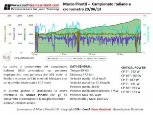
We have just introduced the possibility to highlight and zoom certain areas of the activity graphs in order to allow a finer level of analysis. You can visualize the interval data graphically, and have the averages and max of that part in a table.

This functionality is quite advanced and is entirely implemented in the browser, no need to have a version for a Windows PC, Linux or a Mac. You just need a computer with the browser and you can analyze your data or if you are a coach, the athletes’s data, anywhere and anytime.

This is a feature that can be found in advanced desktop performance analysis software. Since it requires some computing power, at the moment we do not enable it on tablets or smartphones. However, all the other functionalities on Selfloops are completely available on any platform and devices, tablets and smartphones included.
Give it a try.

Selfloops Android apps ANT+ certified

Our Android applications have been officially certified by the ANT Alliance. The certification process makes sure the applications conform to the standard and therefore they are able to communicate with the many accessories in the ANT+™ ecosystem. The certification guarantees that if you use our applications you can safely and accurately have your ANT+ accessories working.

Another milestone for Selfloops!

You can find our apps in the thisisant website product directory listing together with the accessories and sensors that are compatible with:

ANT+ is a trademark of Dynastream Innovations


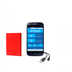
Selfloops ANT+ Accessory brings ANT+ capability to over 400 million active Android devices

The Selfloops ANT+ accessory has received its first press release from the ANT Alliance.

See NEW DEVELOPMENT SOLUTION CREATED TO BRIDGE ANT+ IN EXISTING ANDROID SMARTPHONES

Selfloops ANT+ Accessory will bring ANT+ capability to over 400 million active Android smartphones for real-time display of sport, fitness and health data from ANT+ sensors.


A refreshed website and many new features

We have refreshed the look of our website and it looks much more cooler. But we have not just worked on the external design. We have added a lot of new features to our performance management platform.

Some highligts:

  • A dashboard that summarizes your activities, by week, year and to date. It is important you set your target and visualize how you are progressing toward those targets.
  • A performance analysis tab that shows your overall activity with stats and graphs
  • A health status section, because performance management is much more than just training.
  • A detailed bike power analysis tab with statistics and your critical power graph, showing your best performance and max reached during current and your past trainings.
  • A team management framework to provide valuable feedback to your athletes, monitor their activities and performance. And a reporting tool, to keep your management team always aligned and updated with the current season and trainings.