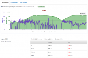
We have just introduced the possibility to highlight and zoom certain areas of the activity graphs in order to allow a finer level of analysis. You can visualize the interval data graphically, and have the averages and max of that part in a table.
This functionality is quite advanced and is entirely implemented in the browser, no need to have a version for a Windows PC, Linux or a Mac. You just need a computer with the browser and you can analyze your data or if you are a coach, the athletes’s data, anywhere and anytime.
This is a feature that can be found in advanced desktop performance analysis software. Since it requires some computing power, at the moment we do not enable it on tablets or smartphones. However, all the other functionalities on Selfloops are completely available on any platform and devices, tablets and smartphones included.
Give it a try.
